
Mobile traffic has steadily overtaken all web traffic and if you are someone who has a website, it should be compatible with any device, especially mobile friendly. This means that your website must be mobile friendly in order to serve as the digital home base for your knowledge commerce firm.
The term ‘mobile friendly’ refers to a website’s general ability to adapt to being accessed via a mobile device rather than a desktop computer. It considers readability, typography, formatting, loading time, and other factors. One subcategory is mobile responsiveness, which refers to website layout adapting to screen size. Your prospective clients will access your website using a range of devices. To ensure that your website serves your business, it must function efficiently for the significant percentage of visitors that arrive by mobile device.
How To Create A Mobile Friendly Website?
Both user experience and user interface design (as they apply to mobile devices) are difficult. Thankfully, specialists i.e., mobile web designers in these industries have outlined actions that website owners can take to improve their design. Here are three crucial design features that everybody with a website should pay attention to:
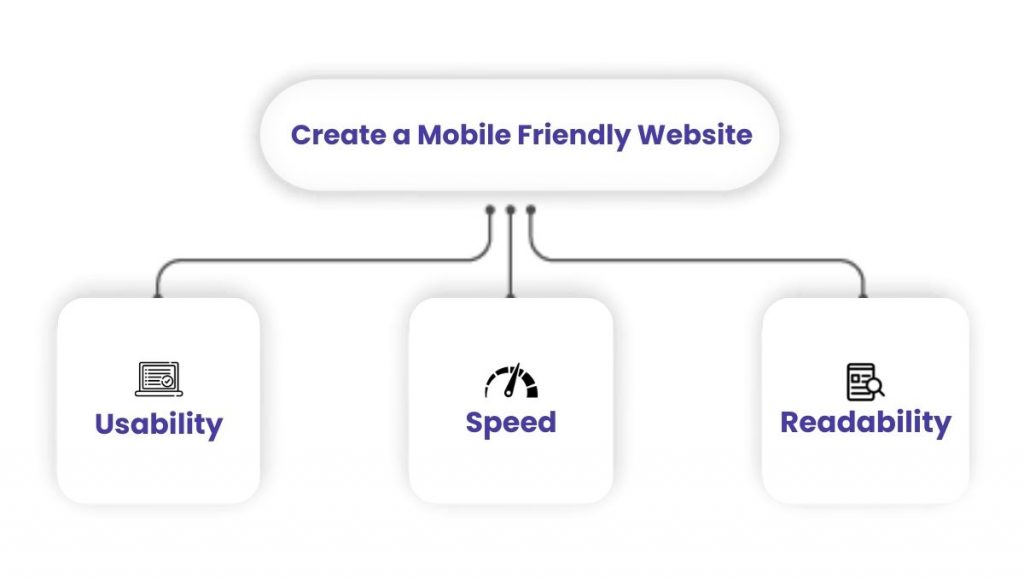
1. Usability
You’ve probably been frustrated by trying to use a desktop version of a website on a smartphone. This entails magnifying small writing, scrolling sideways, and possibly tapping the wrong buttons. Doesn’t it take your focus away from the website’s content? It is critical to be able to use a website as needed. Otherwise, visitors will leave the site.
Neil Patel, a digital marketing specialist, presents data on some of the most prevalent issues that mobile web consumers have recently encountered. According to the data, 51% of respondents visited a website that crashed, froze, or had an issue, and 48% visited a website with a difficult-to-read layout.
2. Speed
Another important factor in enabling strong mobile web experiences is site performance. According to Patel’s research, 73% of respondents recently visited a site that was too slow to load on mobile. However, speed is subjective. What is the speed limit? According to the study, more than 81% of consumers will quit a website that takes longer than 5 seconds to load.
First Contentful Paint and Time to Interactive are two speed-related metrics. FCP is defined by Google as “the time between when the page begins loading and when any part of the page’s content is rendered on the screen.” TTI occurs when a page is completely interactive and ready for a web visitor to begin using it.
3. Readability
The choice of typeface and font has a significant impact on the readability of any written material. Because of the size of the screen compared to written content, it has a particularly large impact on the retention of knowledge learned from mobile devices. Typography is a form of art. You do not, however, need to be a visual designer to implement some of the best practises that can assist strong overall and mobile friendly site design.
On mobile webpages, experts advocate utilising sans serif fonts. These are fonts without frills at the ends of the letter strokes. Sans serif fonts are frequently simpler to read in smaller sizes than serif fonts, making them an excellent choice for any website’s body text.
Adobe suggests employing no more than three font families in a design, and that the choices compliment each other well. They also recommend using a font size of 16 or higher for desktop, 11 or higher for iOS, and 14 for Android.
Another crucial factor to consider is the leading between lines. Text that is too close together might be difficult to read, therefore appropriate spacing can help the eyes.
5 Tried-and-Tested Advices From Our Creators For Budding Creators!
Benefits Of A Mobile Friendly Website Design
As a website owner, your focus is on expanding your reach. And what better way to do that than to make your site mobile friendly? The mobile-friendly design definitely benefits website users, but how does it benefit you as a website owner?
Improved mobile design correlates with improved search engine optimization. The SEO benefits stem from improved website performance since users have a better experience than if they were navigating the desktop version of the site on their mobile device.
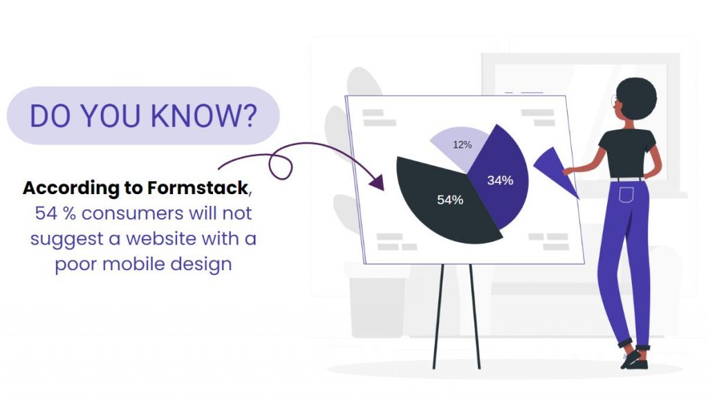
According to Formstack, 54% of consumers will not suggest a website with a poor mobile design. Visitors are more likely to spend more time on your website, travel to additional pages, and share it if the design encourages them to do so. These indicators are all used by search engines to rank results.
But can having a mobile-friendly website directly result in higher search engine rankings? In a way. Google admits that they index content from mobile versions of websites and use it to rank them. As a result, if your mobile site version adheres to the standards and best practices, it can only benefit your rating.
How Exly Supports Mobile Friendly Design
Creators can acces website themes that are mobile responsive on Exly. This provides a wonderful experience regardless of how your customer arrives. This also shortens the time it takes to launch a fully functional website. You don’t have to waste time optimising for mobile or create a second version of a site because it’s already done for you.
If you host a membership community on Exly, it is also mobile friendly. Exly’s website editor includes a mobile view, allowing you to simply ensure that your site looks excellent on mobile devices. It also allows you to personalise your Mobile Layout Settings. Even with our templates, Exly allows you to make design changes to the mobile layout.

Exly understands the importance of mobile-friendly design for our Exlypreneurs. We strike a compromise between presenting you with a mobile-friendly version of the site and letting you customise it as you see fit.


